For when you want e.g. small points on the plot but large keys in the legend
R
ggplot
dataviz
Author
Max Czapanskiy
Published
April 26, 2023
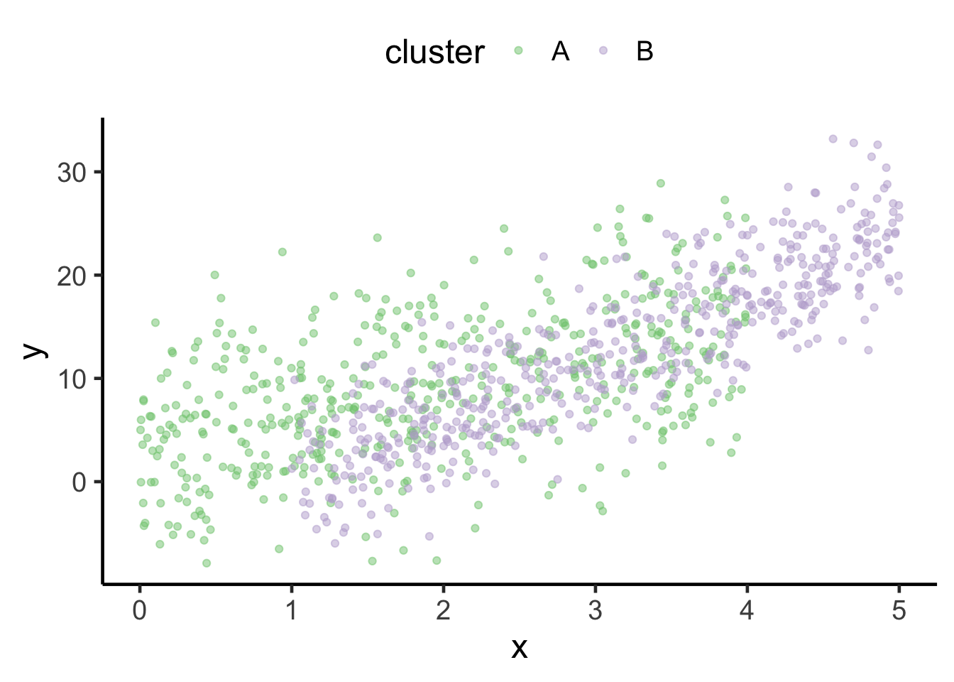
Sometimes it makes sense for your data representation in the figure to be a little different than the legend. For example, here’s a cloud of data from two clusters represented as small, semi-transparent points. The small, semi-transparent aesthetic works when you have a bunch of points next to each other, but isolated as they are in the legend the keys just look washed out.
suppressMessages(library(tidyverse))# Two sets of points with offset distributionsn <-500many_points <-rbind(tibble(x =runif(n, 0, 4),y =3* x +3+rnorm(n, sd =6),cluster ="A"),tibble(x =runif(n, 1, 5),y =6* x -6+rnorm(n, sd =4),cluster ="B"))p <-ggplot(many_points, aes(x, y, color = cluster)) +geom_point(alpha =0.5) +scale_color_brewer(palette ="Accent") +theme_classic(base_size =18) +theme(legend.position ="top")p
Manually over-riding the aesthetic to make the legend points larger and remove the transparency improves interpretation (at least in my opinion). We do that by adding guides() to the ggplot. In this case, it’s the color legend I want to change, so I set the color parameter to a new guide_legend(), which has an override.aes parameter I can use to redefine aesthetics using a list (those aesthetics being alpha and size here). I think this is much easier to interpret.
p +guides(color =guide_legend(override.aes =list(alpha =1, size =3)))